
How to Elevate Your Landscaping Website Design
For many landscape architecture and construction firms, they feel like the work speaks for itself.
The gardens are layered and intentional.
The materials are thoughtful.
The maintenance is meticulous.
The spaces feel alive.
But when a prospective client visits the website, something doesn’t quite translate.
Instead of feeling the depth of the work, they see a standard template. A simple grid of photos. Minimal context. Generic copy, if any at all.
And the result is a quiet disconnect between the caliber of the work and how the firm is presented online.
For high-end landscape firms, your website isn’t just a place to store projects. It’s the first step in establishing fit with the right clients. Before someone ever calls your office, they’re already forming an impression.
Your landscaping firm’s website design should reflect the same level of care, clarity, and intention that defines your outdoor spaces.
Let’s look at how we can close the gap.
Why Landscaping Website Design Should Establish Fit Before the First Conversation
Today’s clients are doing their research long before they reach out, they’re comparing firms, studying portfolios, and asking themselves a simple question: Is this the right team for my project?
A thoughtful landscaping website design helps answer that question before the first email is sent.
Instead of simply displaying projects, the site should communicate:
What it feels like to collaborate with your firm
What makes your perspective distinct
What kind of work you do best
When done well, your luxury landscaping website becomes a filter. It attracts the right clients while gently discouraging projects that aren’t aligned.
That clarity saves so much time for both you and your client. But it doesn’t happen by accident—it begins with a clearly defined strategy.
Start by Building a Strong Landscape Firm Brand Strategy
If a website feels vague or interchangeable, it’s usually because the brand behind it hasn’t been clearly defined.
Before redesigning a site, landscape firms benefit from stepping back and clarifying their brand strategy.
This means identifying:
Your firm’s purpose and philosophy
The voice and tone of your communication
Your point of view on landscape design, construction, or maintenance
How your firm relates to the social or cultural trends that matter to your clients
What differentiates your work from others in the field
Without this foundation, even the most beautiful landscape web design can feel generic.
But when the strategy is clear, every part of the site, from imagery to messaging and everything in between, starts working together to express a cohesive identity.
Not sure if you’ve got a solid brand strategy? Unclear if your digital presence is aligned with your strategic goals? Take our quick 10-question Brand Clarity Audit to reveal where your brand prensce is working and where it’s falling short.
Don’t Assume Your Portfolio Speaks for Itself
Strong photography is essential, but even the most compelling landscape portfolio needs at least a little context.
Too often, landscape portfolio websites rely entirely on images without explaining the thinking behind the work.
The result? Visitors see beautiful spaces but miss the deeper story of how it came to be and the people behind the designs.
Custom website messaging helps bridge that gap.
Your website copy should speak directly to the clients you want to work with and help them imagine what’s possible when they collaborate with your firm.
Consider weaving in elements such as:
Your aesthetic or niche
The approach you take to site-specific design
Who your team is and what the experience of working with them is like from start to finish
This kind of messaging transforms a simple landscape company website into a more meaningful introduction to your process.
Next, Elevate Your Visual Identity to Reflect a High-End Landscape Brand
Luxury brands are defined by restraint. In the context of high-end landscape firm websites, that usually means a refined visual identity.
Thoughtful typography, a distinctive color palette, and consistent, editorial spacing and layouts can immediately elevate how your firm is perceived. These details signal professionalism and confidence while creating space for the work itself to shine.
A polished visual identity communicates that the firm behind the landscapes is just as considered as the landscapes themselves—a hallmark of a high-end landscape brand.
Let the Work Breathe
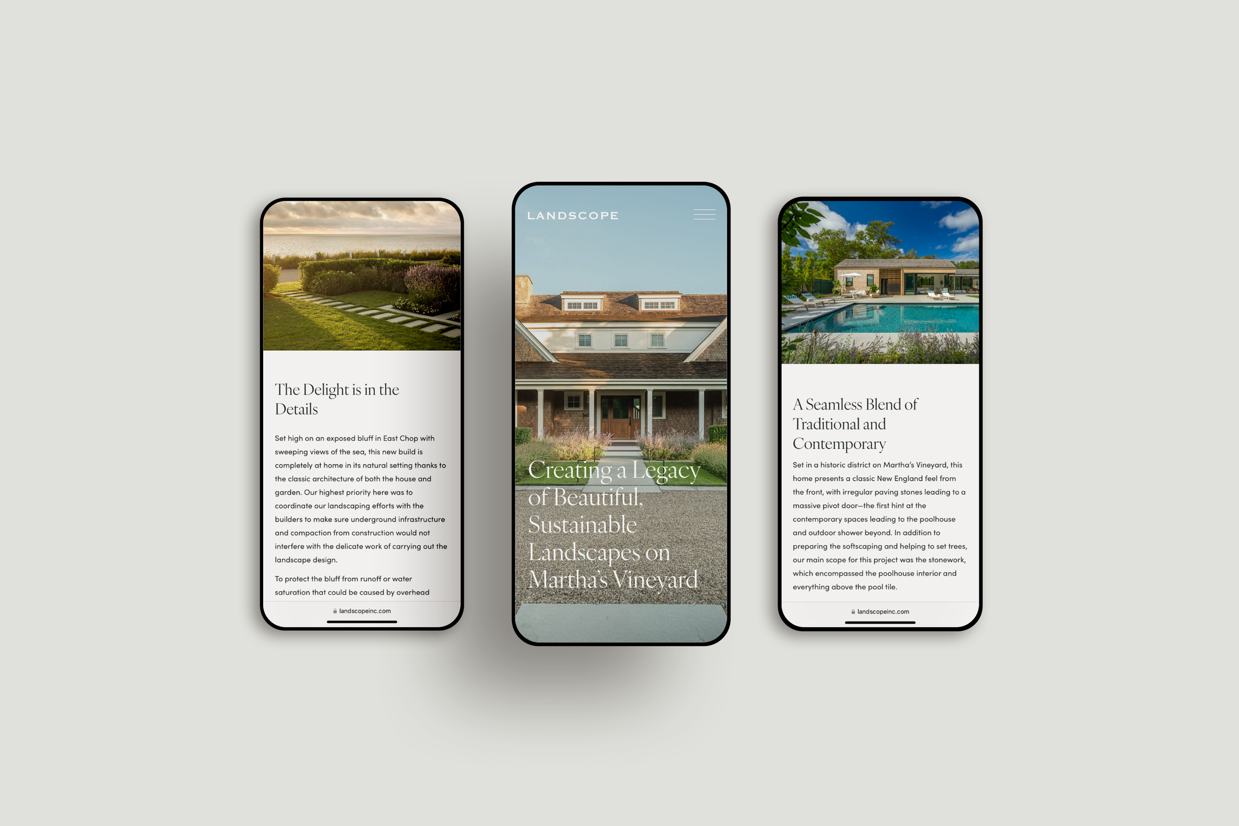
Photography is often the strongest asset a landscape firm has, but how those images are presented makes a significant difference.
Rather than relying on tight grids or small thumbnails, high-end landscape websites tend to favor immersive imagery that fills the screen and allows visitors to linger.
Editorial-style photography can bring landscapes to life by capturing seasonal changes, atmosphere, light, and human interaction within the space. Think: images of wind moving through grasses, reflections on water, or shifting shadows throughout the day help convey something deeper than documentation. These evoke the sensory experience of being immersed the landscape. Some firms are also incorporating short videos that show landscapes in motion—water flowing, leaves moving, light shifting across materials.
Just as important is giving that imagery room to breathe.
Generous white space allows both visuals and messaging to feel intentional rather than crowded. Luxury brands rarely pack information tightly onto a page. Instead, they guide visitors through the experience gradually.
How a user interacts with the content on your site signals the type of experience they’ll have with your brand, so considering thoughtful micro-interactions like gentle hover effects over key images and links can elevate your website. We aim to bring the feeling of walking through a landscape to a digital screen as best as we can.
These interactions may seem small, but together they create a sense of polish that reinforces the quality of the brand—an essential component of intentional and captivating landscape web design.
Lastly, Don’t Neglect the Contact Page
For many firms, the contact page of their landscape company website is an afterthought. But on a well-designed luxury landscaping website, this page often represents the final step before a prospective client reaches out.
Instead of feeling transactional, the contact page should feel like a natural extension of the brand and a warm invitation to begin the conversation.
Consider including:
A thoughtful welcome
A brief overview of the types of projects you take on
A sense of what happens after someone reaches out
This approach reassures potential clients and sets expectations for the collaboration ahead.
Closing the Gap Between Your Work and Your Website
When the work is exceptional but the website feels generic, opportunities can quietly slip away.
The right clients may never reach out because they can’t fully see the depth of what you offer.
However, when you align branding, messaging, and website design, you dramatically improve your landscaping website and ensure it reflects the caliber of your work.
A thoughtful landscape web design helps the right clients recognize your work immediately, understand why it’s different, and why it matters.
Ready to clarify your brand and elevate your website?
Download our Brand Clarity Audit to find out what's working, what's muddled, and what's standing between you and the caliber of clients and projects you're ready for.